Rewriting The King's English
Redesigning for improved search and checkout, one narrative at a time.
Setting:
-
Who: Solo Project
-
Time: Two Week Sprint
-
Tools: Figma, Google Workspace, Zoom
-
Methods: User Interviews with Contextual Inquiry, Competitive and Comparative Analysis, Affinity Mapping, User Persona, User Flow, Journey Mapping, Site Mapping, UI sketching, Wireframing, Usability Testing, Prototyping
Exposition: Introduction to The King's English
The King’s English is a friendly neighborhood bookstore located in Salt Lake City, Utah, welcoming readers all around. While the amiable UI consists of bright colors and images, certain elements of their online website lack consistency and clarity, which can frustrate customers. The goal of this project was to redesign The King’s English’s website to improve search and checkout flows. By the end of the two-week sprint, I had produced a high-fidelity prototype developed in Figma to accomplish that goal. Follow me as I narrate this process.

Protagonist: Defining Our Users
In addition to user interviews, I watched users browse through the King's English website and walk through a purchase. At the end, users completed an initial user satisfaction survey, which would later be compared to survey results after usability testing.
Why do users shop online, and why do they buy books online? What characteristics define favorite online shopping experiences? What causes users to discontinue shopping? These were questions I sought to answer, to learn about user online shopping habits. From their answers and observations, I drew the following insights about user expectations.
Users are frustrated when:
-
They are presented with too many options and categories when searching online
-
Messy search and product pages distract their interaction with the website
-
There are too many extra steps during the checkout process, which make it feel less streamlined
Users need:
-
A way to quickly find and add a specific product she is looking for
-
A way to complete checkout quickly by having automated payment options
-
An e-commerce website to be well presented to sustain her attention
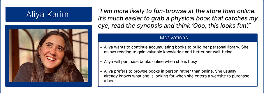
Meet Aliya - The Busy Bibliophile

The Problem:
Aliya needs to have a way to quickly add books to her cart, so that she can complete her purchase promptly and use her time towards tasks of greater priority.
Rising Action: Building Momentum for the Prototype
After thoroughly understanding Aliya’s needs and the problem she has, a comparative and competitive analysis compared key features, such as search and sort results, product display methods, and checkout page (View Analysis Here). While many areas of the website would have benefitted from redesign, research directed my focus to
1) improving product presentation on the home page, 2) revising the quick add feature to provide more detail before adding to cart, and 3) condensing information on the checkout page while adding an automated payment feature, to streamline checkout.
When users first visited the homepage, they often gravitated towards staff picks to browse, however, research suggested users tend to already know what book to purchase when shopping for a book online.


Once a user searches for a book to purchase:
-
Search results display limited products per page, which translates to more scrolling for users
-
There is no option to filter results
-
Users have to scan for version they want in the results (for example, hardcover vs paperback)
-
If a user chooses to add a product to their cart, a confirmation pop up shows limited information

Design changes include updated functionality such as:
-
Allow user to see additional information before fully committing to add to cart
-
Users can easily select version of book (paperback vs hardcover) during add to cart or by filter
-
Give user option to view product details

Now the user is ready for checkout! Breaking down the current user flow allowed me to pinpoint problem areas to target. By identifying these areas, I could then propose a new flow with changes to solve those problems.
Current State Checkout Flow on The King's English Website
Proposed Checkout Flow for The King's English Website

By condensing information, we reduce clutter and the number of steps. Users have to scroll less yet the information remains available should they need to input it.
How That Looks:

Key Design Changes:
-
Give user freedom to edit cart on checkout page
-
Order summary box that scrolls as the user scrolls down
-
Condensing questions and inputs; should the user check yes, requested details will expand. Otherwise it remains hidden
-
Incorporating automated payments such as Apple Pay, Paypal and Venmo
-
Rewording the shipping methods to familiar terms
The Climactic Moment of Truth: Usability Tests
Once the grayscale prototype was functional, it was put to the test. The usability test was conducted under unmoderated, remote testing conditions. Four users were instructed to complete the following tasks:
1) Search for and purchase Cloud Cuckoo Land by Anthony Doerr, Paperback edition.
2) Locate store hours and address.
3) Browse Fantasy Novels
4) Locate information to contact the store
Users Completed:
Task 1 with 100% Success Rate
Task 2 with 100% Success Rate
Task 3 with 75% Success Rate
Task 4 with 100% Success Rate
.png)
See full usability analysis here
Results
Task 1:
Users still had difficulty locating the search bar, tried to click paperback when adding to cart even though it was already selected, reorientation
Task 2:
No errors, no issues
Task 3:
Users expected more categories, had difficulty determining where to begin to start browse, tried to use search bar to browse by genre
The Sequel: Result Interpretation Reiteration
Most of the design changes for search and checkout worked:
-
Though it was not prompted, all users chose to check out via Apple Pay
-
Three out of four users added the item via quick add.
-
Users could easily locate store information and how to contact the business
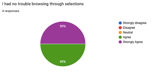
User satisfaction comparison of before and after redesign indicate improvement:
Satisfaction Before Redesign
Satisfaction After Redesign


Mid to Hi-Fi Changes Resulting From Usability Tests
-
Make selection of book version more obvious during quick add by increasing contrast
-
Search bar should be even more prominent - make it taller and include color for better visibility
-
Improve breadcrumbs by underlining and bolding clickable elements, to better help users orient themselves.
Hi-Fi Prototype
The Next Steps for a Continuing Saga
Though the high fidelity prototype has been developed, the story is far from it's end. The next steps include conducting another round of usability testing, to see if the changes were impactful. In addition, the testing showed that my attempt at genre re-categorization did not yield anticipated results. This indicates that further research needs to target genre re-categorization, to better the search experience. Card sorting may be very appropriate to accomplish this. Other additions could include incorporating a search bar that auto-populates genres and titles, to better facilitate search.
It would be valuable to find other user groups to compare these findings to. Will these changes meet those users’ needs? If there is discrepancy, how will I prioritize which user group to be the main focus? Embracing existing findings, how could I potentially mimic the in store experience for users browsing online?
With this project, I continued to learn more about the design process and about myself as a designer. Taking this conceptual project from beginning to end challenged me to continually look at the big picture. Sometimes the problem and the solution to the problem are a lot simpler than I initially make them out to be. I learned it is not necessary to incorporate every single detail. Instead, zoom out and find what is relevant to the whole story. Refining my design process is a design process in itself, so taking in feedback and learning what works and what does not work can only help me rework it into a process that is efficient, and optimal for me.
Afterword: A Reflection
Questions? Comments? Let's chat!
You can email me at anita.trinh.001@gmail.com
Or connect with me on LinkedIn!
Users found the original homepage:
-
Lacking product presentation, aesthetics feel outdated
-
Having a disorganized sidebar, with lack of clear hierarchy, unclear what elements are clickable
-
Search bar with does not meet accessibility contrast ratio, easy for users to miss
Design changes to address concerns:
-
Obvious product highlight with variety for browsing
-
Improved sidebar hierarchy, better separation and distinction
-
Larger search bar with improved contrast for better visibility


→

→

The current layout requires users to ask themselves many questions, and sift through lots of information. Most users do not have this information, such as frequent reader number, coupon codes, and tax exemption ID. One user even skipped this information without reading it because they assumed it didn't matter.
The result is a long checkout page that feels overwhelming and cluttered:
Task 4:
No errors, no issues

