Refining Your Daily Routine
Creating Solutions to Increase User Retention
Project Details
Client: Your Daily
Duration: 2.5 Weeks
Team Project
- Regina Mohan, Project Manager
- Anita Trinh (Me), UX Researcher
- Naomi Schilpp, UX Researcher
- Erica Congemi, UX Designer
Tools: Figma, Google Workspace, Zoom, Slack, Asana
Methods: User Interviews, Competitive and Comparative Analysis, Affinity Mapping, User Persona, User Flow, Journey Mapping, Site Mapping, UI Sketching, Wireframing, Usability Testing, Prototyping, SUS Score Evaluation
Your Daily Health and Wellness
Type A. Perfectionist. People Pleaser. These are just some characteristics defining the woman who experiences burnout, gut health issues and chronic illness due to a dysregulated nervous system caused by stress. Your Daily, is a research backed app that aims to help women build routines to promote healing with personalized coaching plans. To accomplish this in a loving and empathetic way, this app features journaling, daily lessons, de-stress tools, helpful products, courses and workshops.
In a 2.5 week sprint, our team created solutions to improve user retention by reinforcing sincerity and empathy throughout the user experience. We also worked to improve the organization of materials on the app, to better learnability.

Users are dropping off the app about a month into usage. Organization of information is cluttered and does not reflect the brand's ideals of less being more.
So how did we get here?
Our Process
User and App Research
Our research findings helped us identify two user types:
-
The existing, current user
-
The new user
Due to time constraints and alignment with our problem, our team chose to focus on the existing user, Kate.
The Passionate, Overworked, Entrepreneur
Kate
%20(1)%20(1).jpg)
Observant
Thoughtful
Busy
Driven
Organized
Kate's Story
Kate is an entrepreneur who opened up her dream restaurant with her husband a few years ago. She loves pouring her heart into her business but has noticed her anxiety and fatigue have been getting much worse due to the pandemic and overworking. She started to journal more frequently in the last year and downloaded Your Daily three weeks ago, in hopes of getting into a better routine. She really enjoys the app but needs help staying motivated to use it more regularly.
Goals
-
Explore new methods she can incorporate into her health routine
-
See positive changes in her mental and physical health
-
Find more people who share similar experiences
-
Complete daily tasks to stay on top of her health goals
Frustrations
-
Tasks that take too long for her to complete
-
Not knowing what to journal about and feeling stuck
-
Feeling like she is the only one with these problems and not having enough support or resources tailored to her
-
Feeling unmotivated to maintain a routine
In Kate’s current journaling journey, she has the option to choose a journal prompt, however, too many options are available. This makes her feel overwhelmed. In addition she is unable to journal in the app.
The lack of input on her end makes the experience feel less personal. These pain points, plus not having a community to connect to make it difficult for Kate to find motivation to return.

To address user retention, we drew gamification inspiration from competitors, by showing streaks, earning badges and including encouraging pop-ups. A majority of users also expressed how useful tracking is when using other apps, a recurring feature we identified during competitor and comparator analysis.
This research led us to design an activity tracking feature to help users view their progress.

Including these features, we hypothesize the improvement in Kate's journey
Simplifying Navigation
Zooming in on the current sitemap, I noticed there was quite a bit of repetition. Users were accessing the same materials from multiple points throughout the website, which can be confusing and result in cognitive overload. This also makes navigation messy as there is no clear organization.


To improve the information architecture, I reframed the map to reduce redundancy by allowing for only one point of access, as seen to the left. Doing so would also improve learnability for the user.
With the simplified navigation, Kate can now easily and quickly access the tools and resources she needs.
Mid-Fi Prototype Wireframes
Putting Our Design to the Test
Goal: Users will be able to complete assigned tasks in less than 30 seconds with no more than 2 errors.
Logistics
-
In lab testing and remote testing
-
Moderated testing
-
4 participants
-
3 tasks
Metrics
-
Task Time
-
Task Completion
-
Error Rate
-
Initial and Mid-Fi System Usability Scale (SUS) Score Comparison
On average, users completed all three tasks within the parameters of our goal.
Tracker Feature
Users felt the task page was confusing, because they were unable to prioritize where to direct their attention, which indicated poor visual hierarchy.

Under the new Tracker feature, users more often visited the “Achievements” tab first, despite “Tasks” being the default. Users found viewing the calendar and activity to be higher priority and were pleased with this feature.

Progress bar was easily missed, not as satisfying to see, vs something that "fills up".
To Address this in the Hi-Fi:
Switch Achievements and Tasks tabs. Achievements is now the default so users immediately see their milestones and activity
Visually pleasing, on brand badges
Favorites relocated to the explore page, a more intuitive location. The tasks page now has improved visual hierarchy
Use progress rings instead of the progress bar to provide greater visual distinction and user satisfaction when filled up
Resources

Users needed to scroll all the way through the explore page to find the types of materials offered on the explore page
Renamed "Resources" to "Explore", with the intention that users come here to browse and discover resources
Too much content and too many boxes on the explore page meant users were being overloaded with information. This also makes the page feel cramped and busy.

To Address this in the Hi-Fi:
Rename "Explore" back to "Resources". "Resources" suggest the availability of helpful materials users can find, which can be missed with "Explore"
.png)
Include access to saved materials
Include filters at the top of the Explore page to search by resource type
Make explore boxes larger to make the page feel more breathable, thereby also reducing content overload
.png)
Encouragements
To Address this in the Hi-Fi:
Users liked the idea of encouraging messages when they accomplished certain tasks, however our pop-up design was easily dismissed as users mentioned it felt “ad-like"
The “View Achievements” wording on the pop-ups was also confusing, as users did not know what their “Achievements” were

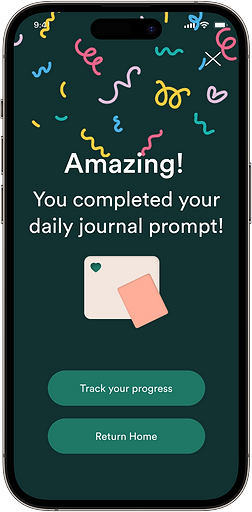
Design encouragements to be full screen instead of as a pop-up
Rename “View Achievements” to “Track Your Progress”

Final Hi-Fi Prototype
Journal Flow
Resource Flow
Tracker Flow
See Full Prototype Here
What Next?
-
Hi-Fi usability testing to validate or invalidate changes
-
Break up initial assessment to make it more digestible
-
Currently, all users get the same first few lessons. Having users complete the assessment in smaller chunks may make the process feel less cumbersome
-
-
Hone in on user research regarding the community feature
-
We discovered that users want community. Now we ask ourselves, what specific features will accomplish this?
-
-
Create a library of encouragement pop-ups for variation
-
Arrange journaling emotions by usage - A user’s more frequently used emotions cycle to the top and remain there until another emotion is used more.
My Role and Contributions
Together as a team we wrote and conducted user interviews. As a UX Researcher for our project, I suggested having a before and after SUS survey, to provide a quantitative metric when comparing the original app and our prototype. I wrote the initial survey, which we as a team then edited. I played a heavy role in planning the usability tests and interpreting the test results for immediate hi-fi updates.
As someone who is very interested in information architecture, I identified the areas of repetition on the original sitemap and what it meant for users. I then used this information to propose a new, more effective sitemap.
In addition, I delivered the “Resource” page by designing and redesigning for that user flow.
Personal Takeaways
-
Have effective time blocking to have productive discussions. While I really enjoyed the initial conversations our team had, to align ourselves and bounce ideas off of each other, some of those conversations did end up being longer than anticipated, and yet were maybe not as productive as we had hoped. Recognizing that we are going around in loops will help us direct the conversation to be more actionable in the future.
-
Follow that up clarifying questions with a suggestion or insight. This will also direct conversations to be more efficient.
-
Understanding each other’s working styles and personalities will help the team anticipate what potential issues can arise and therefore how to resolve them should they come up. Remember to refer back to this once it has been decided!
-
Learnability does not signify poor usability. New users may need time to adjust to the app, so keep this in mind before dismissing all mistakes as a result of poor design. Clarify with the user.
-
Routine communication with the client will ensure the best delivery for both parties. Updating and meeting with our client throughout the sprint ensured we were on the same page regarding expectations. Clarification is key to success.
-
Seemingly simple copy can make or break the user experience.
Questions? Comments? Let's chat!
You can email me at anita.trinh.001@gmail.com
Or connect with me on LinkedIn!
The Problem:
The Solution:
Designing features that motivate users to return, such as activity tracking to view progress, gamification to provide joy through rewards, and frequent encouragements to offer a sense of greater support and accomplishment.

Kate needs encouragement because she wants to feel supported in her wellness journey, so that she is more motivated to create a consistent routine.
The proposal then, is to design features that entice Kate to return. To address journaling, we included:
-
An option to allow users to enter their current mood in order to receive a personalized journal prompt.
-
A “Just Write” option, in case users do not need or want a prompt.
-
Ability to write in the app to accommodate users who choose to do so. Users also have the option to take a photo of a pen and paper journal entry to save to their records.

